If you've been reading my blog for any amount of time Hannah Nicole's name will not be a new one to you :) She's the fabulous designer behind my blog+site, she attended my summer adventure internship this summer, and she took fabulous engagement pictures of me and The Boy. I'm so happy to have her guest post today and talk about a few of the things she does best: branding + designing. Have fun reading and then leave her some love in the comment section!
 Hey Y'all! My name is Hannah Nicole -- I'm a photographer and graphic designer in the lovely state of Minnesota (fondly referred to as Minnesnowta in the months from November-March). I was able to attend Jessica's faaaabulous Summer Adventure and actually gave a little talk on design for the other lovely interns! I'm the designer behind Jessica's blog and site and was super excited when she asked me to post a little about the design portion of your branding today!
I have a five step process I go through when creating (any) design that I'm going to summarize in a few words: envision, define, scribble, design. And today, I'm going to walk you through the process of creating a logo for your business (or blog)! I'm making a logo for a fictional photographer we'll call Jane Jones.
Before I even open photoshop, it's really important to take time to define your brand. I like to start by figuring out what inspires my client and what they gravitate towards in a design (by asking questions, making a pinterest board and determining what about the images/text they like, sketching ideas out, etc....), and start defining my brand based on who they are. Then, I start scribbling logo ideas/shapes/styles before I even begin drafting in photoshop. That way I have time to get the ideas flowing and I have a vision for the finished design before I even begin working with pixels and whatnot. :)
After I have an idea of who you are and what your brand is (and what you want it to be), are inspired and fired up, and have a few ideas and a vision for what you want the end result to look like, it's time to start creating your logo! When I get to this point, I can't stress enough the value of using a good font family as the base of your design. In addition to that, when designing a logo (or a website), it's best to stick to two-three fonts at max, being sure to use three different styles. Using more than one font with the same style (such as two script fonts, two serif fonts, etc...) can clutter your design and ruin the simplicity and general aesthetic, because the similarity of the fonts are off-putting. Keep it simple and stick to pairing up to three font families that vary in style. I always try to avoid trendy fonts, color schemes, and design styles. You want your logo to look classic, timeless, and original, and to ensure that, you have to do something a little different. Innovate, not imitate. :)
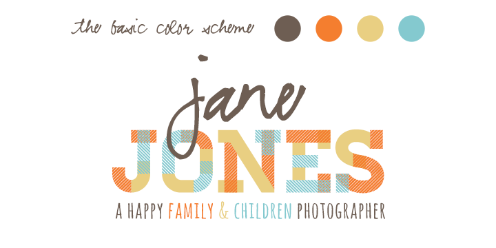
Below are two sample logos, each with the same text but very different styles. For the first, I used standard fonts you can find on pretty much every computer out there, and did little more than place them together. It's pretty blah, kinda ugly, and not at all profesh. For the second, I used several font families that aren't super trendy but are fun while still maintaining a professional feel.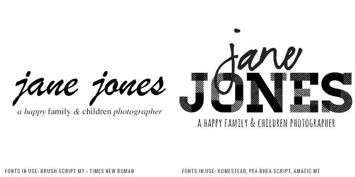 By this time, you should have an idea for your logo + a rough draft of the end product. Now it’s time to play with colors! It’s important to start out designing in greyscale (or just b&w) so that you’re not designing based on the colors. The colors should add to the design and the logo should not hinge on them -- if your logo was only in b&w, your message should still be able to come across. I like to choose 2-3 colors (or in rare cases, 4) and pair neutral tones with more vibrant hues to create a design that is appealing yet impactful. For this logo, I wanted the design to feel youthful (because she -- the fictional photographer -- is shooting mainly kiddos and families), yet still polished and professional.
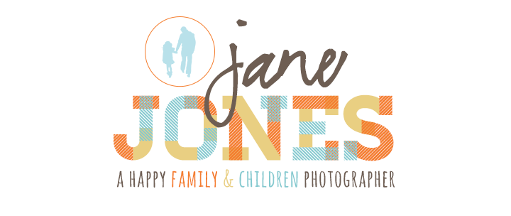
 You’ve got the vision, style, and colors all down! Now it’s time to spice it up a bit. Sometimes simple logos are the best, and there’s absolutely nothing wrong with a streamlined design. But, if you’re looking to add a little variety to your logo to add even more pizazz (yes, I did just say that), this is the time to do so. If you’re adding additional elements to your logo, make sure that they fit with your brand. Everything has to have a “WHY” behind it. For example, don’t just add a flower because it looks nice. Make sure that anything you add is integral to your brand and not just clutter added for the sake of style. For this logo, I decided to put in a little vector I made of a little girl and her dad -- which fits with the brand.
 Now that your logo is complete (and looking FABULOUS), look at the overall design + feel of it and carry that theme throughout your whole site. Stick to your color scheme, use the same elements, keep the same tweaks + quirks + styles. Be consistent! This will not only strengthen your logo, but it will add power and impact to your site, and help to create a brand that is instantly recognizable as yours.
 Hopefully these tips + my workflow helped a little! Thanks so much to sweet Jessica for having me guest post today! :)
xoxo, Hannah Nicole
BLOG // FACEBOOK // DESIGN
Hey Y'all! My name is Hannah Nicole -- I'm a photographer and graphic designer in the lovely state of Minnesota (fondly referred to as Minnesnowta in the months from November-March). I was able to attend Jessica's faaaabulous Summer Adventure and actually gave a little talk on design for the other lovely interns! I'm the designer behind Jessica's blog and site and was super excited when she asked me to post a little about the design portion of your branding today!I have a five step process I go through when creating (any) design that I'm going to summarize in a few words: envision, define, scribble, design. And today, I'm going to walk you through the process of creating a logo for your business (or blog)! I'm making a logo for a fictional photographer we'll call Jane Jones.
Before I even open photoshop, it's really important to take time to define your brand. I like to start by figuring out what inspires my client and what they gravitate towards in a design (by asking questions, making a pinterest board and determining what about the images/text they like, sketching ideas out, etc....), and start defining my brand based on who they are. Then, I start scribbling logo ideas/shapes/styles before I even begin drafting in photoshop. That way I have time to get the ideas flowing and I have a vision for the finished design before I even begin working with pixels and whatnot. :)
After I have an idea of who you are and what your brand is (and what you want it to be), are inspired and fired up, and have a few ideas and a vision for what you want the end result to look like, it's time to start creating your logo! When I get to this point, I can't stress enough the value of using a good font family as the base of your design. In addition to that, when designing a logo (or a website), it's best to stick to two-three fonts at max, being sure to use three different styles. Using more than one font with the same style (such as two script fonts, two serif fonts, etc...) can clutter your design and ruin the simplicity and general aesthetic, because the similarity of the fonts are off-putting. Keep it simple and stick to pairing up to three font families that vary in style. I always try to avoid trendy fonts, color schemes, and design styles. You want your logo to look classic, timeless, and original, and to ensure that, you have to do something a little different. Innovate, not imitate. :)
Below are two sample logos, each with the same text but very different styles. For the first, I used standard fonts you can find on pretty much every computer out there, and did little more than place them together. It's pretty blah, kinda ugly, and not at all profesh. For the second, I used several font families that aren't super trendy but are fun while still maintaining a professional feel.
By this time, you should have an idea for your logo + a rough draft of the end product. Now it’s time to play with colors! It’s important to start out designing in greyscale (or just b&w) so that you’re not designing based on the colors. The colors should add to the design and the logo should not hinge on them -- if your logo was only in b&w, your message should still be able to come across. I like to choose 2-3 colors (or in rare cases, 4) and pair neutral tones with more vibrant hues to create a design that is appealing yet impactful. For this logo, I wanted the design to feel youthful (because she -- the fictional photographer -- is shooting mainly kiddos and families), yet still polished and professional.
You’ve got the vision, style, and colors all down! Now it’s time to spice it up a bit. Sometimes simple logos are the best, and there’s absolutely nothing wrong with a streamlined design. But, if you’re looking to add a little variety to your logo to add even more pizazz (yes, I did just say that), this is the time to do so. If you’re adding additional elements to your logo, make sure that they fit with your brand. Everything has to have a “WHY” behind it. For example, don’t just add a flower because it looks nice. Make sure that anything you add is integral to your brand and not just clutter added for the sake of style. For this logo, I decided to put in a little vector I made of a little girl and her dad -- which fits with the brand.
Now that your logo is complete (and looking FABULOUS), look at the overall design + feel of it and carry that theme throughout your whole site. Stick to your color scheme, use the same elements, keep the same tweaks + quirks + styles. Be consistent! This will not only strengthen your logo, but it will add power and impact to your site, and help to create a brand that is instantly recognizable as yours.
Hopefully these tips + my workflow helped a little! Thanks so much to sweet Jessica for having me guest post today! :)
xoxo, Hannah Nicole
BLOG // FACEBOOK // DESIGN


Loved this post Hannah..thanks so much for sharing--I remember some of these things from what you shared in tx, but also have some new things to keep in mind too when I'm designing! ;)
ReplyDeleteLoved this post Hannah..thanks so much for sharing--I remember some of these things from what you shared in tx, but also have some new things to keep in mind too when I'm designing! ;)
ReplyDeleteHannah Nicole. awesome sauce at its finest.
ReplyDeleteyou're just really cool, okay? okay.
ReplyDeleteThis was so much fun to read! Thanks so much for sharing, and awesome work.
ReplyDelete--Kellie
Hannah, your the coolest. Even with spaghetti.
ReplyDeletexo
You are dee beeeest :D
ReplyDeleteThank you so much for this! I'm actually a designer myself (well, not 'officially') & found most of these steps familiar, but I definitely also picked up a few tips. It never really occurred to me to start grayscale. I always started with a color logo, and looking back, I can see how that could've dragged me off the look I was aiming for.
ReplyDeleteeve @ essence of eve
enjoyed this thoroughly!
ReplyDeleteI love love love this. So much. You are a doll.
ReplyDeletethese are some great tips! definitely bookmarking this to keep in mind someday. orrrrrrr, i may just take the easy way out and invest some money in the lovely hannah nicole designs. ;]
ReplyDeleteAwesome information! I'll definitely keep this in mind the next time I try to design anything.
ReplyDeleteI never thought to design without color first... had a "duh" moment reading this. :-) Thanks for the tips!
ReplyDelete